The hardest design problems rarely start in Figma
When people picture AI in design they imagine visual tasks: moodboards, UI iterations, wireframes, button labels, first-pass concepts. Those use cases exist and we use some of them.
But that's not where designers get stuck nowadays. The hard part happens earlier. It's when a flow technically works and still feels wrong. When interview notes contradict each other in ways that don't resolve cleanly. When a research round produces a theme that sounds right and nobody checks it, because checking it means reopening something everyone considers settled.
That last one is the expensive failure, because it doesn't feel like a failure at any point. It feels like progress.
Two things we have actually done with Claude
Pressure-testing IA before committing
Before locking a navigation structure on a client project, we described the proposed IA and asked where it saw confusion. What we sent, near enough verbatim:
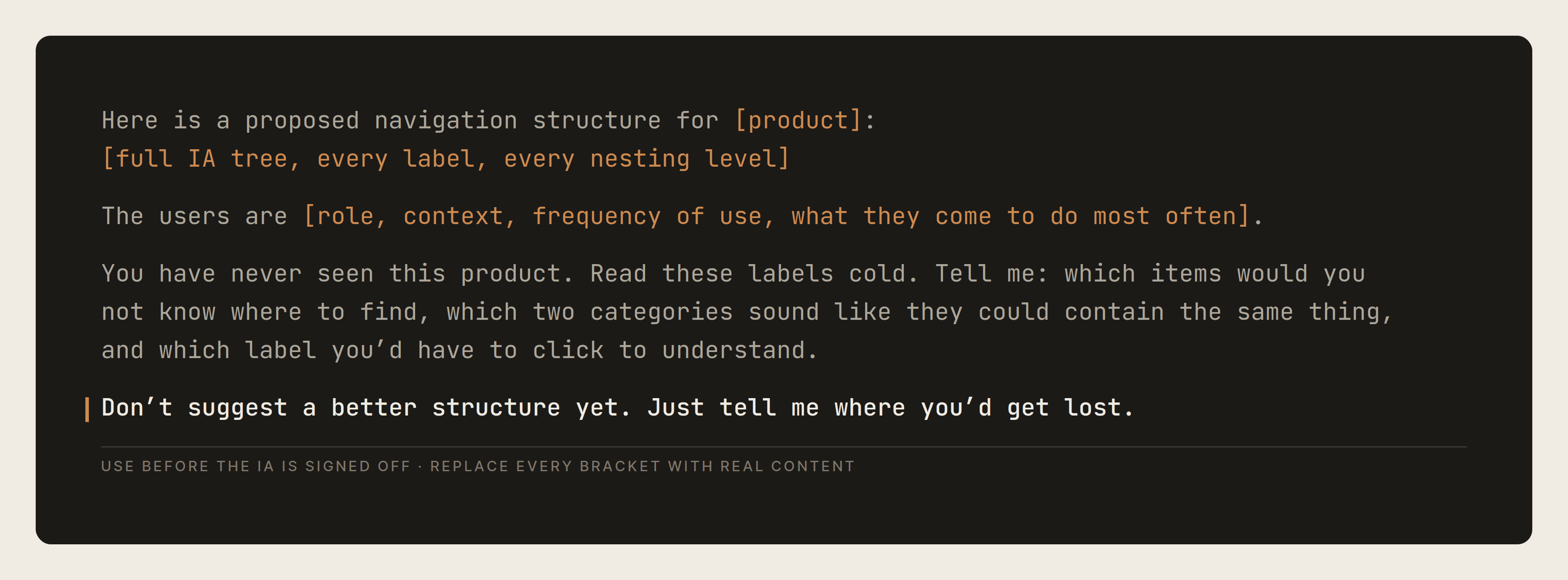
The last two lines matter more than the rest. Without them you get a redesigned IA, which is not what you asked for and not what you need - you need the failure points in the one you already have.
It flagged a category grouping that made complete sense to us internally and would be opaque to someone arriving fresh. When you're many weeks deep you stop seeing it the way a new user would. Claude hasn't been in your Figma file for three weeks, and that distance is exactly what's useful.
The conclusion we nearly designed around
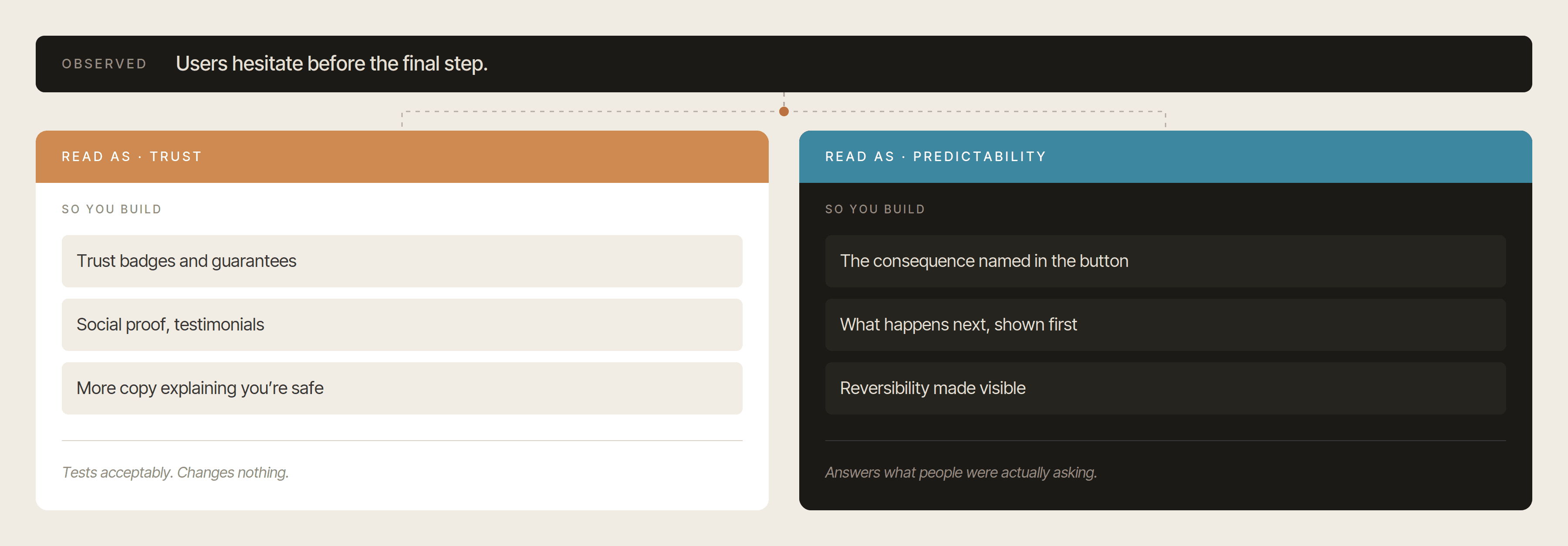
After a round of usability tests, our notes pointed toward a trust problem. Users hesitating at moments we hadn't anticipated, backing out of steps we thought were straightforward. Trust was the word that came up in the debrief, it explained most of what we'd seen, and within a day it was in the summary document and shaping what we were going to design next.
Before committing, we ran the raw notes back through Claude and asked it to attack the conclusion rather than support it:
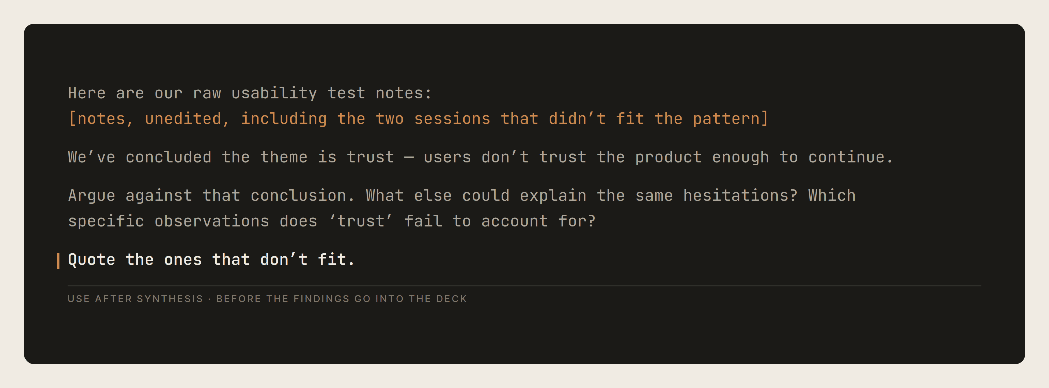
Three parts of that prompt are doing the work. Including the sessions that didn't fit the pattern - those are the ones you instinctively leave out of a summary, and they're where the counter-evidence lives. Asking it to argue against rather than evaluate, because "what do you think of this conclusion" gets you agreement with caveats. And asking it to quote the observations that don't fit, so the pushback is anchored in our data rather than in general reasoning about products.
It came back with a different reading. The hesitation wasn't about trusting the product - it was about not knowing what would happen next. Users weren't asking is this safe, they were asking what happens if I press this. Predictability, not credibility.
Reading the notes again with that framing, it was obvious. The hesitations clustered before irreversible-looking actions, not before actions involving anything sensitive. We'd pattern-matched to the more familiar explanation.
Why the distinction mattered
Those two readings produce completely different designs, and both look reasonable in a review.
A trust problem gets solved with reassurance. Badges, guarantees, social proof, testimonials, more copy explaining why you're safe. All of it additive, all of it making the interface heavier.
A predictability problem gets solved by telling people what happens when they press the button. Naming the consequence in the button label. Showing what comes next before it comes. Making reversibility visible where it exists.
We'd have built the first one. It would have tested acceptably - reassurance rarely makes anything measurably worse - and the hesitation would have stayed exactly where it was, and we'd have concluded that users needed more reassurance still.
Where it saves time day to day
UX writing looks small until you're doing it properly. Error states, confirmations, empty states, permission requests, onboarding copy - none of it individually difficult, all of it requiring real context, and all of it deprioritised until the end of a project when everyone is tired. Claude produces a solid first draft if you give it enough context: where the user is in the flow, what they're trying to do, what emotional state they're likely in, what constraints exist, what tone the product should hold. You still edit heavily. Editing decent raw material is faster than writing from scratch.
Writing the rationale behind decisions is something most of us do badly, because it feels like documentation and documentation gets deferred. It matters at handoff, during future iterations, in stakeholder conversations, and especially when a new designer inherits the product six months later. It's useful here because it forces the reasoning to be explicit. What feels obvious in your own head often isn't.
Accessibility pre-checking, with the caveat that real accessibility work still requires proper testing and audits. WCAG 2.1 AA compliance is legally required in the EU through the European Accessibility Act and none of that process gets replaced. What it does is catch the obvious things earlier: unclear hierarchy, overloaded flows, copy that's hard to parse, form behaviour that makes no sense. The later those are found, the more expensive they are.
Where it costs
Asking for an assessment gets you agreement. This is the failure mode that cost us the most time, and it's structural rather than occasional. Phrase the question as "what do you think of this conclusion" and you get a reply that broadly supports your reading, adds a few hedges near the end, and reads as confirmation. Nothing in it is wrong. It's answering a different question - you asked it to weigh a conclusion, not to break one, and weighing produces balance.
Both prompts above work because they instruct it to argue against us. The useful rule we ended up with: if the reply leaves you feeling better about the work than you did before you sent it, you asked the wrong question.
We wasted time asking it to solve rather than to break. Early on we'd ask for a better version of what we had, and get back competent generic patterns - the average of every product in the category. Slow to recognise as useless, because it looked like output.
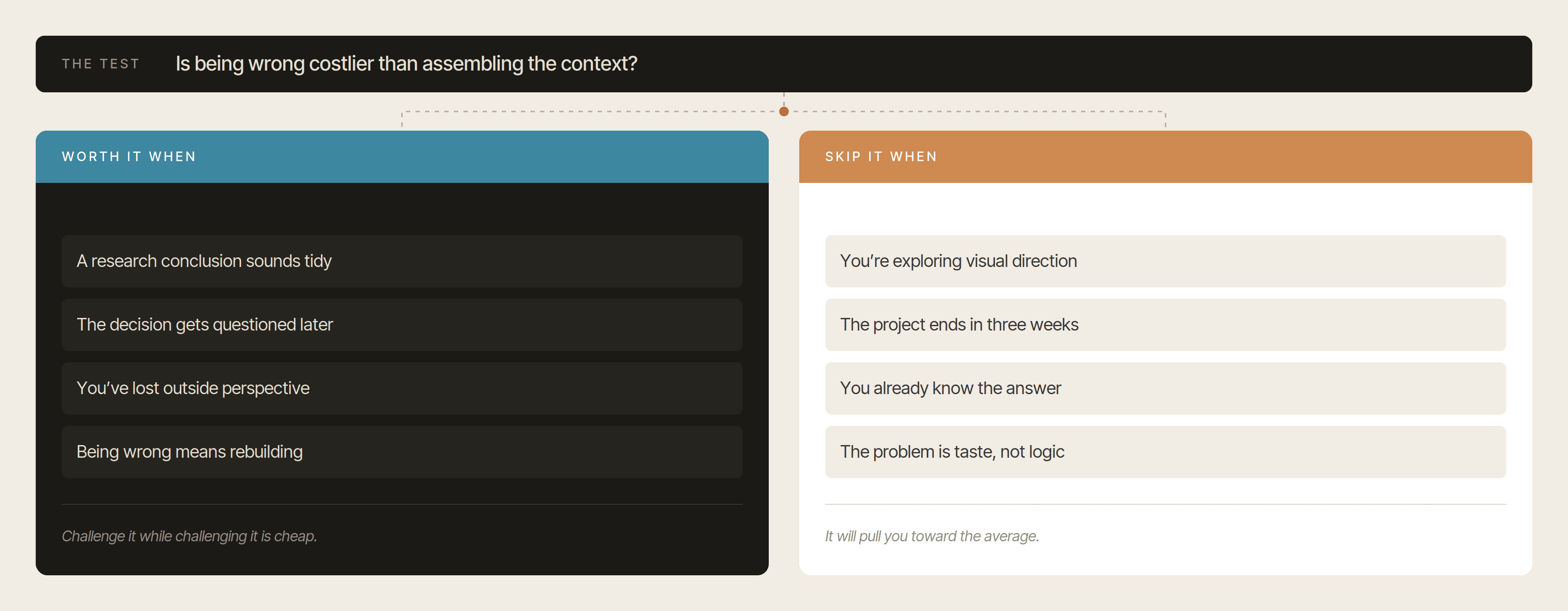
It's expensive on short projects. Assembling enough context for a useful critique takes real time. On a two-week engagement it doesn't pay back. It pays back where a decision has to be defended later, or where being wrong means rebuilding.
It won't tell you when to stop. Ask for objections and you'll get objections, indefinitely, including ones not worth acting on. Deciding which pushback matters is entirely yours, and there's a real failure mode where you redesign around a critique that didn't need addressing.
Where AI still falls short
It doesn't understand your users. It doesn't know the history behind a product decision, the internal dynamics of your team, or what's actually meant by feedback like "something about this just doesn't feel right." That sentence can contain months of accumulated product intuition. AI doesn't have access to any of it.
It also doesn't have taste - not really. It can identify whether a layout follows usability conventions. It can recognise patterns. It can optimise for clarity. But it doesn't know when something is technically fine and emotionally forgettable. It can't tell the difference between a polished interface and one that has actual personality. That's why so much AI-generated work feels interchangeable right now - it tends toward the average, and the average is easy to produce. Which is what makes judgment more valuable, not less.
Note what it didn't do in our case. It didn't find the reframe on its own - it found it because we handed it the notes we'd have otherwise summarised away, and told it to attack a conclusion we'd already reached. The judgment was in what we gave it and what we asked.
When it is worth bringing in and when it is not
Assembling the context takes real time. So the decision isn't "should I use this," it's "is this the kind of project where being wrong is the expensive part."
What actually changed for us
Not the amount of design work. That's the same, and the decisions are still ours to make and defend.
What changed is that conclusions get one deliberate attempt at being broken before they turn into screens. A research theme, a navigation structure, a flow everyone in the room already agrees on - each of those now gets challenged while challenging it is still cheap. Not because the challenge is usually right. Because the cost of finding out in production is so much higher than the cost of finding out now.
None of that is an AI capability. Design teams have always known that conclusions should be tested before they're built on. What changed is that it stopped requiring a spare colleague with fresh eyes and two hours to give you.
The conversation around AI in design is still heavily focused on generation - what it can make, how fast, how finished it looks. The more interesting shift is happening earlier, in whether the conclusions driving the design are the right ones.
Before you open Figma on your next project, take the theme your research produced and ask something to argue against it. If it falls apart in that conversation, it would have fallen apart in production too - just later, and more expensively.