There are better things to do in a sprint than playing spot the difference with your own designs.
The pattern is pretty familiar. The sprint closes, something ships, and a few hours later a message lands in Slack: "That button looks off." Or: "Wasn't this supposed to be a different shade?" By the time someone flags it, the developer is already in a new ticket and the fix becomes its own mini-project.
We weren't doing anything wrong exactly. We had Figma files, we had developers who cared about getting things right. But the gap between a finished design and what actually lands in the browser is easy to miss when you're reviewing five screens in a hurry before a release.
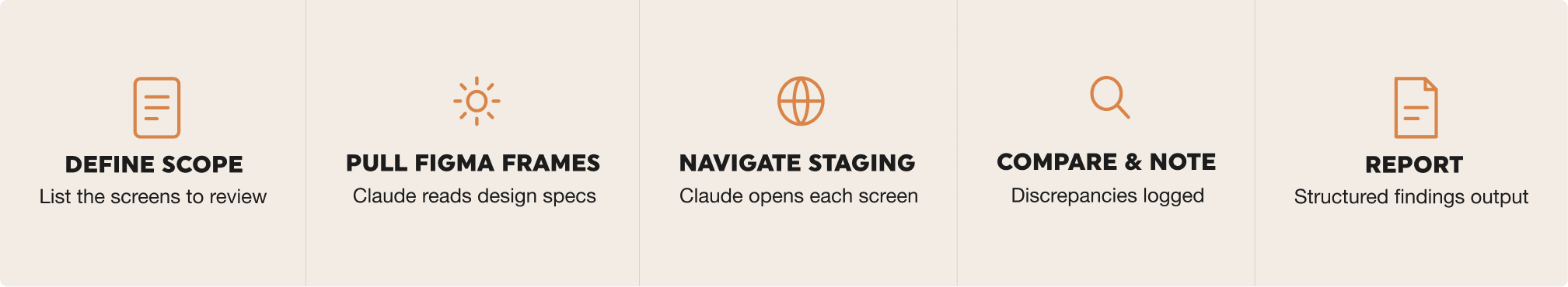
That's what got us looking at Claude Dispatch. The idea was simple: give Claude access to both Figma and the staging environment, let it do the screen-by-screen comparison, and review findings instead of screens.
Design QA doesn't take a lot of skill. It takes a lot of attention. That's exactly what an AI is good at.
What Claude Dispatch actually is
Claude Dispatch is Anthropic's way of letting Claude interact with external tools rather than just respond to text. You connect it to a browser, to Figma, to whatever your workflow needs, and Claude can navigate and read those environments directly. It's not about pasting screenshots into a chat window. It's a proper connection that stays in place.
For Design QA the setup is two connections: your staging environment and your Figma file. Once those are linked, Claude can open a screen in staging, pull up the matching Figma frame, and compare them side by side. No manual back and forth.
How to set up the process
Enable access to your environment
Our staging environment is behind a username and password prompt, which is the simplest case to handle. When you set up the browser connection in Dispatch, you provide the staging URL along with those credentials. Dispatch stores them and uses them automatically each time it navigates the environment.
Worth noting: don't use your personal login or anything tied to a real user account. Create a dedicated reviewer account with read-only access. It's cleaner from a security standpoint and you don't have to worry about Claude accidentally triggering something in the app.
After adding the browser connection, navigate to a few screens manually within Dispatch before running any QA session. You want to confirm that fonts load, images render, and any login flows complete properly. It takes five minutes and saves a lot of confusion later.
Connecting Figma
The Figma connection goes through Claude's integrations panel. You'll find an option to connect Figma, click through an OAuth login, and grant Claude read access to your files. The whole thing takes a couple of minutes.
Once connected, you'll reference frames by file. It helps to have your Figma file key ready. It's the string in the URL between /design/ and the next slash. That's what you'll pass to Claude when you want it to pull a specific frame.
Getting your Figma file ready
You don't need to restructure anything major, but a few small habits make the comparisons much more useful.
-
Name frames to match the screen names in your app, so there's no ambiguity about what maps to what
-
Group frames by section or feature, following the same structure as your app's navigation
-
If you've made overrides to component instances, detach them. Claude reads what's in the frame, not what the base component says
-
Keep a dedicated "current release" page with only the frames that are live in staging right now
Running a Design QA session
With both connections in place, the actual review is just a matter of prompting Claude well. Here's the flow we use.
Writing your prompt
The quality of the output depends a lot on how specific you are. Vague prompts produce vague findings. Before running a session, be clear about which Figma frames you want checked, which screens in staging they correspond to, and what you want Claude to look at.
A format that works well for us: tell Claude which Figma file and page to reference, give it the staging path to navigate to, list what to compare (colours, type, spacing, copy, layout), and ask for structured output with a severity level for each finding. So instead of "check if the dashboard matches Figma," something like:
Open the Dashboard frame on the Releases page in Figma.
Navigate to /dashboard on staging.
Compare the header, stats row, and sidebar.
Flag any differences in font weights, spacing, colours, or copy.
Output findings as a numbered list with severity: minor, moderate, or critical.
Using the changelog as context
One thing that makes a real difference: paste the release changelog or developer update notes directly into the prompt. Instead of asking Claude to compare everything on a screen, you're telling it exactly what changed in this release and asking it to verify those specific things.
This works well for a few reasons. Claude knows where to focus, so the session is faster and the findings are more relevant. It also means you're not getting flags on things that were always that way. Claude is checking against what actually changed, not doing a full audit every time.
In practice it looks something like: paste the changelog at the top of your prompt, then follow it with the usual instructions about which Figma frames to reference and which staging screens to open. Something like:
The following changes shipped in this release: [paste changelog].
Open the affected screens in Figma and staging and confirm each change is implemented correctly.
Flag anything that looks different from what the changelog describes or from the Figma spec.
The goal is to give Claude a concrete list of what to look for rather than asking it to notice everything.
Summary
What Claude catches well
From our sessions so far, Claude is reliable at picking up:
- Colour deviations: wrong shade of a brand colour, incorrect opacity, hover states that don't match
- Typography mismatches: wrong font weight, size off at a specific breakpoint, line-height differences
- Copy discrepancies: placeholder text that got left in, labels that drifted from what Figma says, truncation that wasn't designed for
- Layout shifts: elements aligned differently to the spec, padding missing, gaps between components that are off
- Missing or swapped elements: an icon that got substituted, a section that was dropped during implementation
What still needs a human eye
Claude is good at the systematic stuff. It's not a replacement for actually looking at the product. Things like whether an animation feels right, whether a micro-interaction is satisfying, or whether a layout that's technically correct still reads as awkward: those still need a designer's judgement. Claude handles the first pass so you can spend your time on the things that actually require taste.
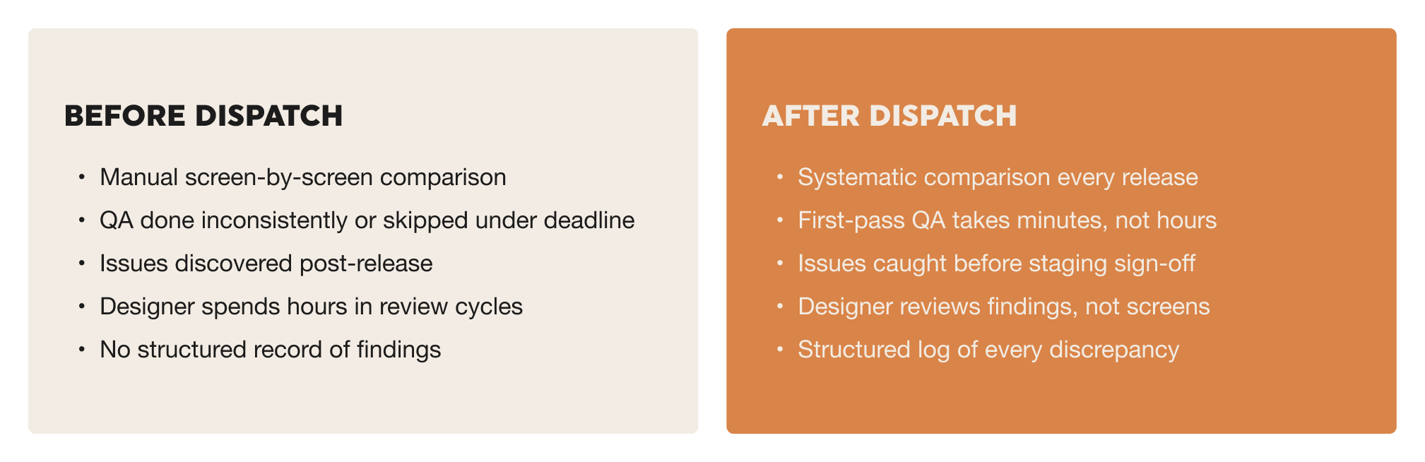
Before and after: what changes
Tips for making it stick
Make it a required step, not an optional one
The teams that get the most out of this are the ones that treat Design QA as non-negotiable before a staging sign-off. If it only happens when someone has time, it won't happen consistently enough to matter. Build it into your release checklist the same way you'd build in a code review.
Keep a prompt template
Your first prompt will be rough. After a few sessions you'll know exactly what level of detail works for your setup. Write that down and keep it somewhere shared. A reusable template means anyone on the team can run a session, not just the person who figured it out the first time.
Feed findings into your issue tracker
Ask Claude to format findings in a way that maps cleanly to how your team works. A numbered list with severity, the affected screen, and a short description of the problem is usually enough. Getting that into Jira or Linear takes seconds, and it means design issues go through the same channel as everything else.
Check your Figma file before each session
Claude treats Figma as the source of truth. If a frame is out of date, say a decision got made in staging that wasn't reflected back in the design file, Claude will flag the staging version as wrong even if it's actually right. A quick check before running a session avoids false positives and keeps the findings trustworthy.